Taking into consideration the long history of the toothpaste brand (it was introduced in the US in 1915), it is only natural that the Pepsodent logo has gone through multiple updates.
Meaning and history
Pepsodent is a popular mint-flavored toothpaste brand. The brand belongs to Unilever, but in 2003 the rights to the brand in the U.S. and Canada were acquired by Church and Dwigh. History of the brand Pepsodent begins in the 1920s.Today this toothpaste belongs to the best-selling products in the economy segment.
The brand’s mission is to help improve people’s oral health and habits through our products, expert advice and innovation.
What is Pepsodent?
Pepsodent is the name of a recognized global expert in oral care, which offers multifunctional solutions for a variety of oral problems and conditions. The rich history of Pepsodent brand begins in the 1915s in the USA. The original toothpaste formula contained the substance pepsin, which gave the brand name.
1915 (according to other sources – 1901)
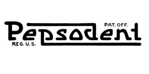
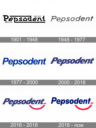
The original logo was the most creative one. The ends of the “P” and “D” were extended, other glyphs also had an unusual shape.
1948
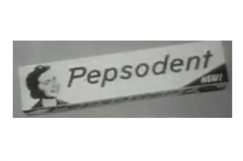
A simpler sans was introduced. The initial, the “P,” had an elongated end at the top.
1977
The “thorn” on the “P” was removed, the “t” adopted a curve. You can already see that the wordmark is blue.

2000
The italics on the Pepsodent logo were much more noticeable.
2016
A red curve appeared under the logo.
2018
In this version, the italics are not so extreme. The red curve has been preserved, though.
Font and Color
The bold title case lettering from the Pepsodent visual identity is set in an italicized geometric sans-serif typeface with heavy stable characters and straight cuts of the lines. The closest fonts to the one, used in this insignia, are, probably, Europa Grotesk Nr 2 SH UltraBold Italic, or Neue Haas Grotesk Display 96 Black Italic.
As for the color palette of the Pepsodent visual identity, it is based on one of the most elegant combinations — blue, red and white, which stands for excellence, quality and professionalism, and at the same time is always actual, stylish and bright.


